This article deals with plotting line graphs with Matplotlib (a Python’s library).
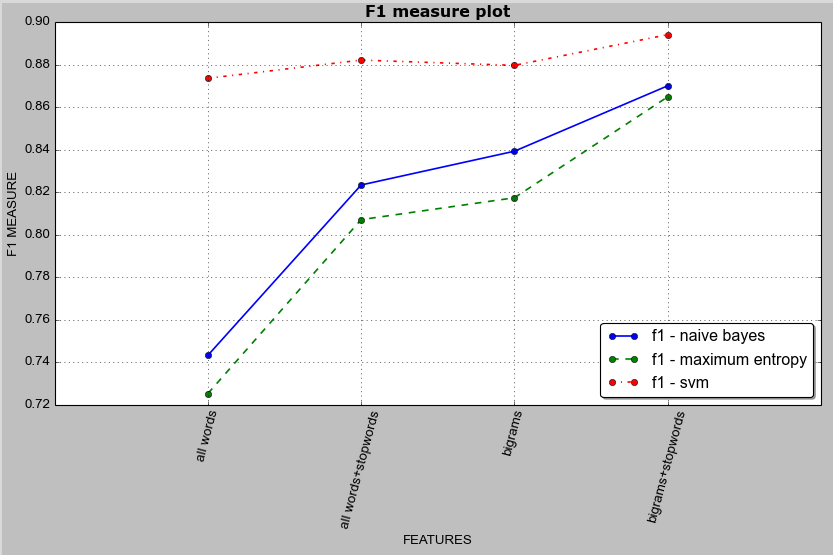
In the article Machine Learning & Sentiment Analysis: Text Classification using Python & NLTK, I had described about evaluating three different classifiers’ accuracy using different feature sets. In this article, I will be using the accuracy result data obtained from that evaluation.
Below is the result data which we will use to plot line graph. The data is saved in a CSV file named result4-accuracy-blog.csv.
| classifier | f1-all-words | f1-all-words-stopwords | f1-bigrams | f1-bigrams-stopwords |
|---|---|---|---|---|
| nb-cv | 0.7433089087 | 0.8234760775 | 0.8393691561 | 0.8701525025 |
| maxent-cv | 0.7253148838 | 0.8071790028 | 0.8174686897 | 0.8649529103 |
| svm-cv | 0.8736806002 | 0.8822418834 | 0.8797546237 | 0.8942136239 |
As seen above, the CSV file contains accuracy result in terms of F1 measure while using cross-validation during evaluation.
Row 1 = Heading information
Row 2 = Accuracy result for Naive Bayes Classifier
Row 3 = Accuracy result for Maximum Entropy Classifier
Row 4 = Accuracy result for Support Vector Machine Classifier
Col 1 = Accuracy result using “all words” feature set
Col 2 = Accuracy result using “all words with stopword filter” feature set
Col 3 = Accuracy result using “bigram words” feature set
Col 4 = Accuracy result using “bigram words with stopword filter” feature set
Here is the full Python & Matplotlib code to plot the line graph:
import matplotlib.pyplot as plt
import csv

x = []

y_f1 = []
y_f1_nb = []
y_f1_maxent = []
y_f1_svm = []

var = [ ('all words', 'f1-all-words'),
        ('all words+stopwords', 'f1-all-words-stopwords'),
        ('bigrams', 'f1-bigrams'),
        ('bigrams+stopwords', 'f1-bigrams-stopwords'),
      ]

my_x = []

for i,(key, val) in enumerate(var):
    x.append(i+1)
    my_x.append(key)

i = 0
with open('result4-accuracy-blog.csv') as myfile:
    reader = csv.DictReader(myfile, delimiter=',')
    for line in reader:
        if i == 0:
            for (key,val) in var:
                y_f1_nb.append(float(line[val]))
        elif i == 1:
            for (key,val) in var:
                y_f1_maxent.append(float(line[val]))
        elif i == 2:
            for (key,val) in var:
                y_f1_svm.append(float(line[val]))
        i += 1

fig = plt.figure()
ax = plt.subplot(111) # row x col x position (here 1 x 1 x 1)

plt.xticks(x, my_x, rotation=75) # rotate x-axis labels to 75 degree
ax.plot(x, y_f1_nb, label='f1 - naive bayes', marker='o', linestyle='-', linewidth=1.5)
ax.plot(x, y_f1_maxent, label='f1 - maximum entropy', marker='o', linestyle='--', linewidth=1.5)
ax.plot(x, y_f1_svm, label='f1 - svm', marker='o', linestyle='-.', linewidth=1.5)

plt.xlim(0, len(var)+1)
plt.tight_layout() # showing xticks (as xticks have long names)
ax.grid()

plt.title('F1 measure plot', color='#000000', weight="bold", size="large")
plt.ylabel('F1 MEASURE')
plt.xlabel('FEATURES')

ax.legend(loc='lower right', fancybox=True, shadow=True)

plt.show()
Here is the image of graph drawn:

Drawing two plots in a single figure
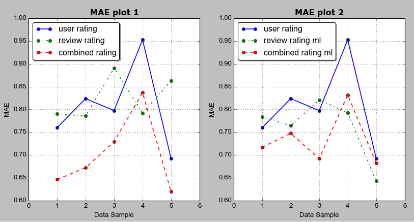
Below is the data from an experiment done for one of my projects on Recommender System. I have used Mean Absolute Error (MAE) as the evaluation metrics. 5-fold cross validation was done using different ratings (user ratings, review ratings, combined ratings). The 5 rows represent MAE value from the 5-fold cross validation result. The data is saved in a CSV file named result3-blog2.csv.
| user-rating-mae | review-rating-mae | combined-rating-mae | review-rating-mae-ml | combined-rating-mae-ml |
|---|---|---|---|---|
| 0.7600547353 | 0.7902372419 | 0.6465361166 | 0.7836969362 | 0.7170221067 |
| 0.8237862834 | 0.7856703376 | 0.672306641 | 0.7644275049 | 0.7477524197 |
| 0.7975864851 | 0.8903382338 | 0.7290656284 | 0.8204793297 | 0.692127153 |
| 0.9526498766 | 0.7919194216 | 0.8369751416 | 0.7931655463 | 0.8319407532 |
| 0.6929469033 | 0.86291894 | 0.6198757585 | 0.6431204488 | 0.6824413178 |
Here is the full Python & Matplotlib code to plot the line graph (2 line graphs in a single figure):
import matplotlib.pyplot as plt
import csv

x = []
y_stars_mae = []
y_text_round_mae = []
y_mean_round_mae = []
y_text_round_mae_ml_bigram = []
y_mean_round_mae_ml_bigram = []

i = 0
with open('result3-blog2.csv') as myfile:
    reader = csv.DictReader(myfile, delimiter=',')
    for line in reader:
        i += 1
        x.append(i)

        y_stars_mae.append(float(line['user-rating-mae']))
        y_text_round_mae.append(float(line['review-rating-mae']))
        y_mean_round_mae.append(float(line['combined-rating-mae']))
        y_text_round_mae_ml_bigram.append(float(line['review-rating-mae-ml']))
        y_mean_round_mae_ml_bigram.append(float(line['combined-rating-mae-ml']))

fig = plt.figure()
ax = plt.subplot(121) # row x col x position
bx = plt.subplot(122)

#linestyle = '-', '-.', '--'
#color='green', 'blue', 'red'
ax.plot(x, y_stars_mae, label='user rating', linestyle='-', marker='o', linewidth=1.5)
ax.plot(x, y_text_round_mae, label='review rating', linestyle='-.', marker='o', linewidth=1.5)
ax.plot(x, y_mean_round_mae, label='combined rating', linestyle='--', marker='o', linewidth=1.5)
ax.grid()
ax.legend(loc='upper left', fancybox=True, shadow=True)
ax.set_xlim(0, 6)
ax.set_title('MAE plot 1', color='#000000', weight="bold", size="large")
ax.set_ylabel('MAE')
ax.set_xlabel('Data Sample')

bx.plot(x, y_stars_mae, label='user rating', linestyle='-', marker='o', linewidth=1.5)
bx.plot(x, y_text_round_mae_ml_bigram, label='review rating ml', linestyle='-.', marker='o', linewidth=1.5)
bx.plot(x, y_mean_round_mae_ml_bigram, label='combined rating ml', linestyle='--', marker='o', linewidth=1.5)
bx.grid()
bx.legend(loc='upper left', fancybox=True, shadow=True)
bx.set_xlim(0, 6)
bx.set_title('MAE plot 2', color='#000000', weight="bold", size="large")
bx.set_ylabel('MAE')
bx.set_xlabel('Data Sample')

plt.show()
Here is the image of graph drawn:

Hope this helps.
Thanks.