This article deals with plotting line graphs with Matplotlib (a Python’s library).
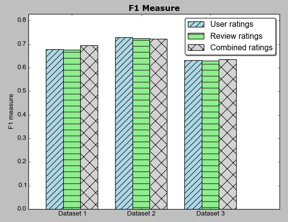
Below is the data which we will use to plot the bar chart. The data is saved in a CSV file named result3-blog.csv.
| f1-user-rating | f1-review-rating | f1-combined-rating |
|---|---|---|
| 0.6784625994 | 0.6765937247 | 0.6948878326 |
| 0.7284832769 | 0.7246427177 | 0.7226608468 |
| 0.6312079408 | 0.6294511058 | 0.6367180825 |
As seen above, the CSV file contains result in terms of F1 measure which is an accuracy measure generally used to evaluate Machine Learning experiments. We have F1 score from three different sets of experiments,
a) while using user rating
b) while using review rating
c) while using combined rating
We have evaluated each experiment 3 times. Hence, there are three rows of value data.
The details about these three experiments is not much of value over here. We can directly concentrate on the data shown above.
Here is the full Python & Matplotlib code to plot the bar chart:
import matplotlib.pyplot as plt
import csv
import numpy as np
import math

x = []
y_stars_f1 = []
y_text_round_f1 = []
y_mean_round_f1 = []

i = 0
with open('result3-blog.csv') as myfile:
    reader = csv.DictReader(myfile, delimiter=',')
    for line in reader:
        i += 1
        x.append(i)

        y_stars_f1.append(float(line['f1-user-rating']))
        y_text_round_f1.append(float(line['f1-review-rating']))
        y_mean_round_f1.append(float(line['f1-combined-rating']))

max_value = max([max(y_stars_f1), max(y_mean_round_f1), max(y_text_round_f1)])

fig = plt.figure()

ax = fig.add_subplot(111)

## the data (can be the number of rows in csv file)
N = 3

## necessary variables
ind = np.arange(N)                # the x locations for the groups
width = 0.25                      # the width of the bars

## the bars
rects1 = ax.bar(ind, y_stars_f1, width,
                color='lightblue',
                hatch="//"
                )

rects2 = ax.bar(ind+width, y_text_round_f1, width,
                    color='lightgreen',
                    hatch="-"
                    )

rects3 = ax.bar(ind+width+width, y_mean_round_f1, width,
                    color='lightgrey',
                    hatch="x"
                    )

# axes and labels
ax.set_xlim(-width,len(ind)+width+(width/2))
ax.set_ylim(0,max_value+0.1)
ax.set_ylabel('F1 measure')
ax.set_title('F1 Measure', color="black", weight="bold", size="large")
xTickMarks = ['Dataset '+str(i) for i in range(1,6)]
ax.set_xticks(ind+width+(width/2))
xtickNames = ax.set_xticklabels(xTickMarks)
plt.setp(xtickNames, rotation=0)

## add a legend
ax.legend( (rects1[0], rects2[0], rects3[0]), ('User ratings', 'Review ratings', 'Combined ratings'), loc='upper right', fancybox=True, shadow=True )

#ax.grid()
plt.show()
Here is the image of graph/chart drawn:

Hope this helps.
Thanks.